Every change Google makes tends to get a big reaction from the team here in St. Louis. SEO and social media are fusing closer and closer together, and Google seems to be leading the way.
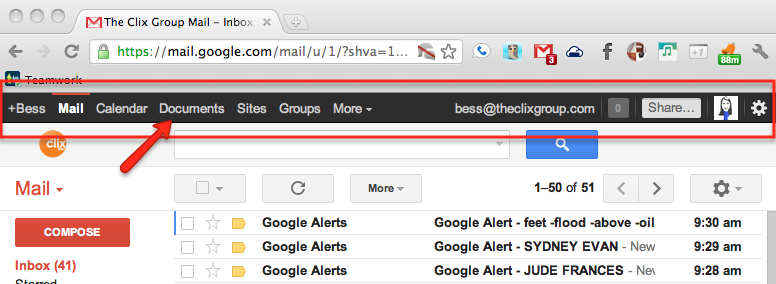
The newest update from Google comes in the form of a redesign of the “Google bar,” the black bar that appears at the top of all Google pages. If you have not yet received the update, your Google bar looks something like this.
The bar first appeared about six months ago. The intent was to streamline all Google apps in all one easy to use location with a special focus on Google Plus (notice the Google Plus profile image, share option, and notifications tracker in the top right corner).
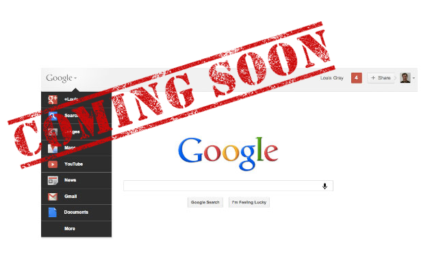
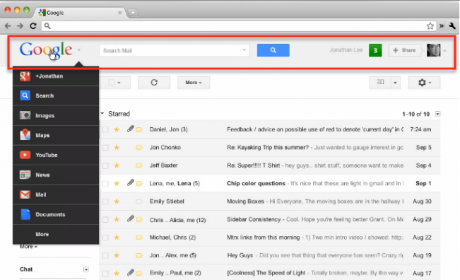
Yesterday Google announced what the official Google blog calls “the next stage” in their redesign: a new Google toolbar. The new toolbar ditches the old black bar, integrating its functions into the search bar that is currently under the toolbar.
The new Google bar has three main regions:
- A drop down menu on the left under the Google logo with links to Google services.
- A search box in the center for the current Google app.
- Google plus features on the right including a notifications ticker and a share box.
The Good
Cleaner design
The new design is arguably much cleaner than the old Google bar. When Google first unveiled the Google bar, many referred to it as a step away from the Google standard of cleaner (and often emptier) design. The new design is arguably more streamlined and thus more aesthetically pleasing.
More space
Though only a small section of the page, the black bar took up valuable real estate. The new Google bar is a simplified version of the old one, allowing for more space on the page.
The Bad
Only on Google sites
The toolbar allows for easy and quick access to some of the most commonly used online features. If you’re anything like me, most of your life is managed through Google. Why not allow the Google bar to show up on every site? If the intent is to streamline internet use into Google and enhance the functionality of Google Plus, wouldn’t that goal be better met if the toolbar were on every page?
Little customization
From what I can tell, the new Google bar does not allow for customization. When you scroll over the Google logo, a set group of Google services appear with the option to view more at the bottom. It would be nice if users could customize which services appear based on which they use most frequently.
Is Google sacrificing functionality for design?
The new design is more visually appealing, but might not be as functional as the previous design. Accessing many of the Google services now requires an added (though fairly simple) step of hovering over the Google logo.
In typical Google fashion, the new feature is rolling out slowly and systematically. Though they have not yet said when people should be gaining access, expect to see it in the next few days. Until then you can check out the new Google bar in this video.
Introducing the new Google bar
UPDATE: If you haven’t been given access yet and would like early access, Mashable has a quick and easy way to hack the google bar available.


