We strive to inform in order to avoid these common misconceptions.
Clix is always looking for ways to help inform our clients on best practices so we can avoid holdups during the design phase. We want to build you a beautifully, fully optimized website, and to do so we need to be on the same page when it comes to the basic do’s and don’ts of website design. Reading through these top 5 myths will help round out your web knowledge and give you the effective finished result you expect.
See a Myth you Want to Know More About? Click the Link Below or Read Through our Full Listings

MYTH: BIGGER LOGOS ARE BETTER
Why A Larger Logo is Not an Effective Way to Get Brand Awareness
Large logos take up valuable space in the header that can be used for navigation or contact information. Your users expect to find your logo in the top left or middle section of the header, so making it larger is a waste of space and can be an eyesore if your logo is not a high-resolution image. Also, making your phone number or other contact information in the header larger has the same negative effect. This is especially true when there are several other places on your website where someone can find it, such as the footer and contact page.
Take a look at these major brands and see how they handle their logos:
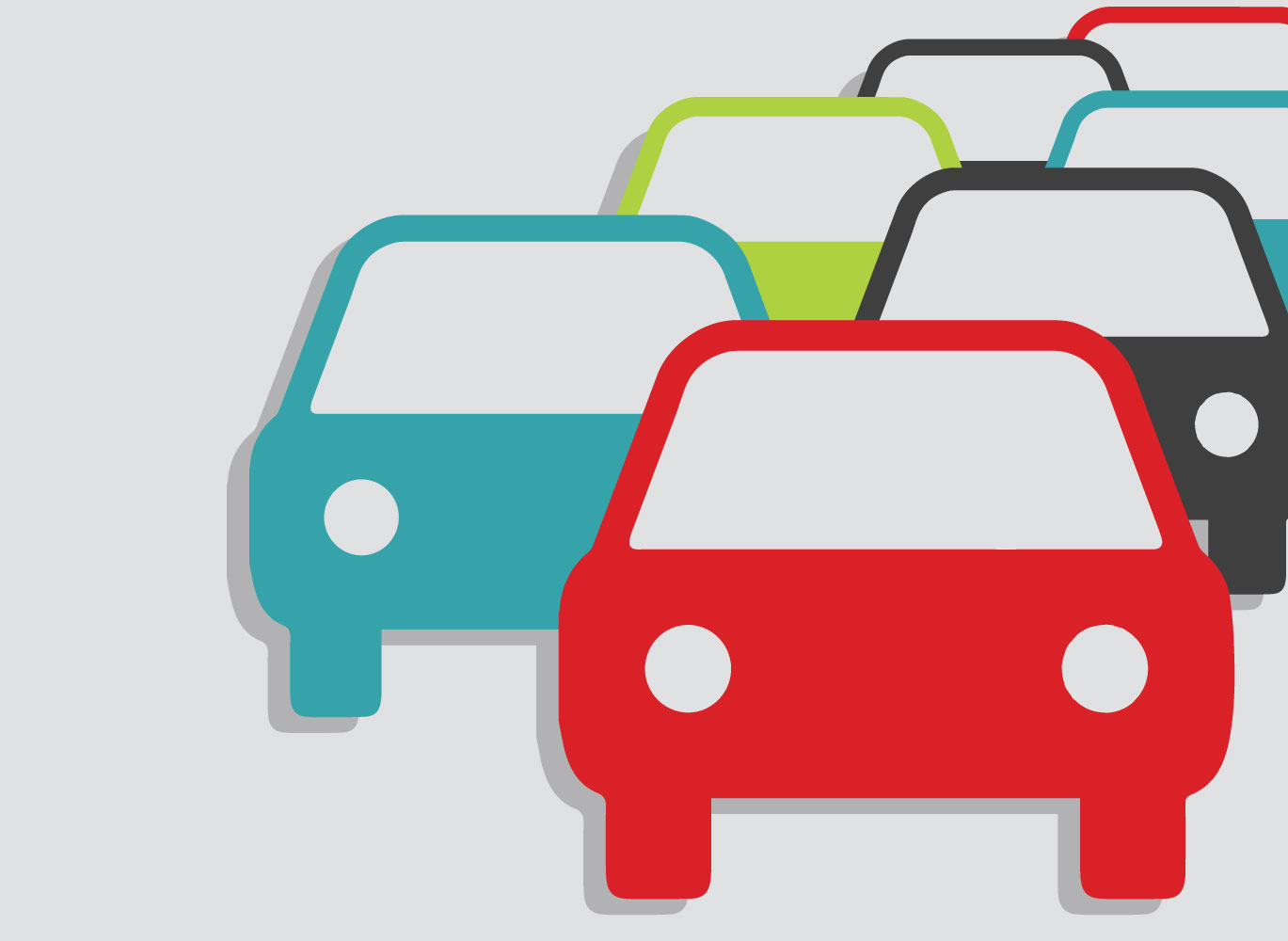
MYTH 2: MORE CONTACT BUTTONS GET CONVERSIONS
Too Many Contact Buttons Will Clutter Your Design Instead of Converting
Having a lot of contact buttons, especially close together, can clutter your page and potentially confuse your user about which next step they should take. The best thing to do is have one or two buttons that are laid out in a way that the user sees them right away on the page, and to have a lot of padding around the button so the user’s eye is drawn to the button.
See how these companies layout their contact buttons to get the best conversions:

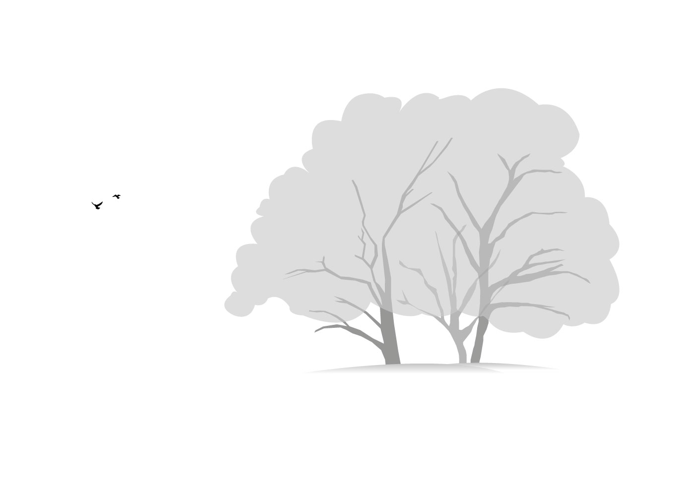
MYTH 3: WHITE SPACE IS A WASTE
Cluttering Your Page with More Content Won’t Help Your Rankings, but it will Hurt Your Aesthetic
Most people assume that you should put as much content on a web page as possible to get higher rankings, but by doing so, you can really hurt yourself in a couple of ways.
When there is too much content crammed together, you lose a sense of hierarchy. You want users to be drawn to each section as a separate entity instead of one massive block. White space, also known as padding, lends itself to the design aesthetic and helps carry elements from one design element into the next.
Take a look at how other companies are using white space in their designs:

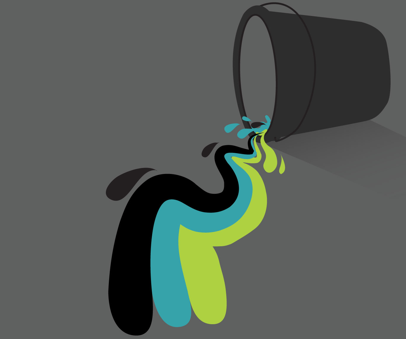
MYTH 4: THE MORE BRIGHT COLORS, THE BETTER
Using Multiple Bright Colors in Your Design is Jarring & Confusing to Your Users
Simplifying your color palette to one or two bright colors will help guide your user down the path you want to take them on within your website. Having too many bright colors is a distraction and will turn users away. We like to use a few bright colors as a way to show links and buttons so the user can clearly identify actions they can take. The goal is to convert and attract, not overstimulate and repel.
View how other brands use a limited color palette to achieve higher conversions:


MYTH 5: KEEP IT “ABOVE THE FOLD”
Long Pages Are the Norm Now, and Users Are Pros at the Scroll
In the early days of web design, users weren’t used to scrolling, so we would try to fit the most important aspects of your website design “above the fold,” or what you first see when you load a page before you start to scroll down.
Now, users are used to scrolling on long pages because of social media websites such as Facebook, Twitter, and Instagram that have infinite feeds. At Clix, we have resources to help pages load faster so users won’t leave the page while they wait for it to load.
View how other brands use longer pages: