This guideline will teach you the basics of Calls to Action (CTAs) and the best ways to promote them on your website.
What is a CTA (Call-to-Action)?
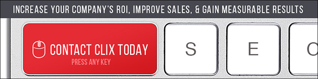
A CTA, or Call to Action, is a link, graphic, or button placed on a web page with the sole purpose to drive leads or visitor awareness. The common misconception is that all CTAs need to drive the user to a form, however, this is not always true. While the vast majority of CTAs are used to drive a user to a simple form, CTAs can also be used to drive a user to information, phone conversation, online chat, or an action that will eventually lead to a customer/business contact.
CTAs can use all kinds of action text but they will generally look like the following…
– Download now
– FREE ….
– Click Here
– Make Appointment
– Contact Us Today
– Sign Up Now
– Save 50%
– Register Now
– etc.
CTA Best Practices
When creating or placing a CTA, there are some general rules to consider. These include…
Graphics
Color Contrast
Always try to add some contrast in the CTA. This contrast will usually allow the CTA to become a focal point. Contrast can be used by using a different color or a slightly varied graphical styling.
Styling
Always try to keep the branding in mind. If the site is a flat layout, use a flat inspired design for the CTA.
Creativity
While creativity and wit can not be taught, an open discussion amongst co-workers can spark an idea
CTA Text
The idea is to offer an incentive or a command to the visitor. Always try to include an action word like “Click Here”, “Save” or “Download Now” The end message should be clear and concise while raising a hint of desire.
Placement
The placement of a CTA can often be as important as the look of the Call-to-Action. Some general rules to follow would be to have the CTA placed withing the main body or header of the website (main CTAs will often appear above the “fold”). I find placing the CTA within the main body content can usually yield the best result.
Whitespace
While this seems like a no-brainer, this simple rule is often looked over. Be sure to include ample negative space around the CTA- this will allow the CTA have more contrast(read above).
Sizing
Decide what size fits best. The CTA should be obvious without being intrusive.
Simplicity of Options
Do not overload a page with too many CTAs pushing for contact. We have all dealt with an annoying or over-achieving salesperson that is too overbearing. We do not want that emulated on our websites; remember how annoying pop-ups used to be 10+ years ago?
Linking
Always test you links. Also decide whether opening a new tab, a white box or a standard link will work best. If the CTA is meant for a simple form fill, I would generally push for a whitebox effect(traffic can be tracked through clicks).

Remember the visitor
They are the main focus of any & all web marketing initiatives. If you keep your desired market in mind, the market will reward you with contact. Be sure to design the Call-to-Action for your market.
With a deeper knowledge of CTAs, I urge you follow these simple rules and reap the benefits.